Posts: 6,442
Threads: 0
Joined: Feb 2006
08-07-2021, 08:48 AM
(This post was last modified: 08-07-2021, 09:03 AM by mound.)
I haven't posted any projects on this forum in years. Not that I haven't done any, just that I haven't kept up with pictures and posting progress/etc..
Time to change that! This will be one of those long running "build threads" for a kitchen remodel in my new house. Hoping I can learn a few things from you fine folks throughout the process. I've done lots of built-ins and furniture, but never a whole kitchen.
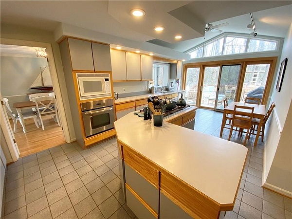
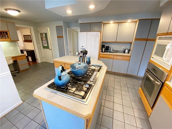
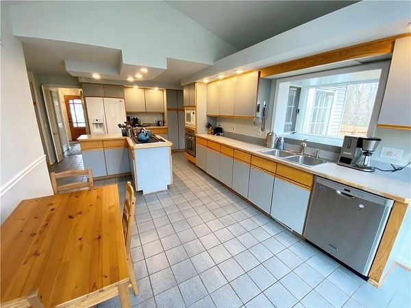
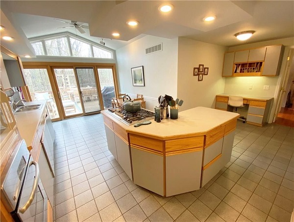
For this first post, I'll start with some pictures of the original space. Not "bad" from a functional standpoint but very "90's" with chunky/boxy soffits for lights and such.. U.G.L.Y

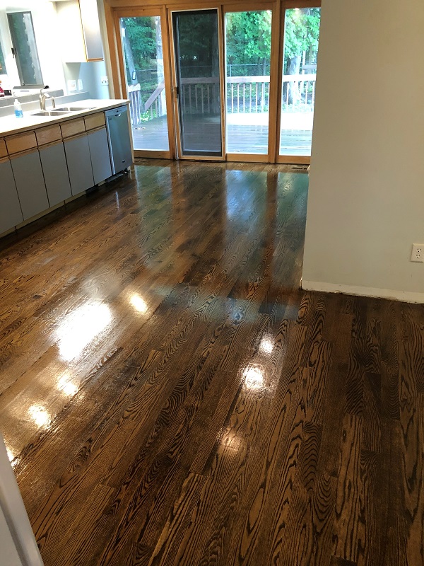
While the house was empty (still is as I write this) we had all the floors throughout the house redone, including replacing the 90's ceramic tiles in the kitchen with more red oak (same species throughout the house.) I removed the old island and desk to do so and temporarily capped the gas and electric for the island below the floor. So now the space looks like this:
That's Red Oak with a 50/50 blend of Minwax Provincial and Jacobean stain (square edge, sanded and finished in place) and is now consistent throughout the entire house including the staircase. Added the Jacobean to really bring out some black in the cathedral grain.
(2nd "first post" to follow, I reached my attachment limit)
Posts: 6,442
Threads: 0
Joined: Feb 2006
08-07-2021, 08:52 AM
(This post was last modified: 08-07-2021, 08:59 AM by mound.)
..continuing..
Time to start planning! (note, I'm naming two services below because I used them, not to spam. I'm not affiliated!)
I used an app on my iPhone called "Canvas" to do a 3D scan of the empty room and got a Sketchup file in return. It was surprisingly accurate to within an inch! I then used a website called fiverr.com where you can get freelancers for most anything you can think of, to work with an architect/kitchen designer. My wife and I pulled together all kinds of pictures from the internet of styles and things we liked, gave some ideas and the 3D scan of the existing space, and the result, for a couple hundred bucks and a week later, was these magazine quality renderings which I never would have come up with. We'll be tweaking things I'm sure, but this is the gist of it:
(two variants of the wet-bar shown)
Just to not get ahead of ourselves in the 3D world, a quick mockup of where the island and chairs would be, so we can sorta feel the space for real before committing to anything:
And finally the Sketchup modeling/planning begins:
So that's it for now.. Next several weeks at least will be moving the family into the house, setting up shop and doing lots more modeling in Sketchup for the actual plan. We've already selected all the appliances and I'll be basing actual measurements on their specs.
Wish me luck!
Posts: 66,295
Threads: 1
Joined: Mar 2007
Location: Massachusetts
I'll bet it's going to turn out beautiful.
Best of luck !!
Posts: 6,442
Threads: 0
Joined: Feb 2006
(08-09-2021, 03:04 PM)barnowl Wrote: I'll bet it's going to turn out beautiful.
Best of luck !!
Thanks!
Posts: 3,136
Threads: 0
Joined: Apr 2005
08-10-2021, 07:39 AM
(This post was last modified: 08-10-2021, 07:43 AM by wing nut.)
(08-07-2021, 08:52 AM)mound Wrote: ..continuing..
Time to start planning! (note, I'm naming two services below because I used them, not to spam. I'm not affiliated!)
I used an app on my iPhone called "Canvas" to do a 3D scan of the empty room and got a Sketchup file in return. It was surprisingly accurate to within an inch! I then used a website called fiverr.com where you can get freelancers for most anything you can think of, to work with an architect/kitchen designer. My wife and I pulled together all kinds of pictures from the internet of styles and things we liked, gave some ideas and the 3D scan of the existing space, and the result, for a couple hundred bucks and a week later, was these magazine quality renderings which I never would have come up with. We'll be tweaking things I'm sure, but this is the gist of it:
(two variants of the wet-bar shown)
Just to not get ahead of ourselves in the 3D world, a quick mockup of where the island and chairs would be, so we can sorta feel the space for real before committing to anything:
And finally the Sketchup modeling/planning begins:
So that's it for now.. Next several weeks at least will be moving the family into the house, setting up shop and doing lots more modeling in Sketchup for the actual plan. We've already selected all the appliances and I'll be basing actual measurements on their specs.
Wish me luck!
Personaly I like the old kitchen more then your markup, except for the flooring the ro is a nice upgrade, but I like lots of natural woods not white on white .
It looks like from the sketchup you moved the stove, is that so? You want the stove/oven top-fridge and sink/dw to form a triangle in the kitchen for work flow patterns
Posts: 9,600
Threads: 0
Joined: Jan 2005
Location: Orlando FL
08-10-2021, 10:49 AM
(This post was last modified: 08-10-2021, 10:49 AM by stav.)
I like what you have there in your plan. The things I would be concerned about is a lack of places to put things near the stove top. Seems like the counter space there is rather sparse. I kind of like the idea the old kitchen had with the wrap around by the stove. You can never have too much space for staging things near the stove in my opinion. The second thing is that long counter top seems like it might become an annoyance if you have to walk all the way around it much. I like the way it looks but thinking from a functionality standpoint it might be better to put a table there or similar so you can create a break. I know that is not how kitchens are done these days though.
Posts: 17,123
Threads: 0
Joined: May 2005
Location: H-town
Disregard wing nut, apparently he has terrible taste.
 Your rendering looks fantastic, and is a vast improvement. Look forward to the project. Did mine last year and am so happy with the results. Having to do the staircase and upstairs now, because the kitchen remodel made the rest look like carp. Nothing like project creep!
Well, Bye...
Posts: 6,442
Threads: 0
Joined: Feb 2006
(08-10-2021, 07:39 AM)wing nut Wrote: Personaly I like the old kitchen more then your markup, except for the flooring the ro is a nice upgrade, but I like lots of natural woods not white on white .
It looks like from the sketchup you moved the stove, is that so? You want the stove/oven top-fridge and sink/dw to form a triangle in the kitchen for work flow patterns
Thanks. I guess taste is a personal thing.. We do plan to use more natural woods than in these renderings. the island will probably end up being predominately a light colored wood.
Yah there will be a double oven in the wall next to the fridge, and the gas range built into the island. I understand the triangle workflow thing, but wanted to leave the sink under the window and the dishwasher next to it. Fridge->Oven->Range->Counter workflow is more important in how we move around than making sure the sink/dw are also right next to those.
Posts: 6,442
Threads: 0
Joined: Feb 2006
(08-10-2021, 10:49 AM)stav Wrote: I like what you have there in your plan. The things I would be concerned about is a lack of places to put things near the stove top. Seems like the counter space there is rather sparse. I kind of like the idea the old kitchen had with the wrap around by the stove. You can never have too much space for staging things near the stove in my opinion. The second thing is that long counter top seems like it might become an annoyance if you have to walk all the way around it much. I like the way it looks but thinking from a functionality standpoint it might be better to put a table there or similar so you can create a break. I know that is not how kitchens are done these days though.
Keep in mind the counter along the wall will extend all the way through where the oven/microwave are currently.. So there will be lots of counter space directly to the left of the gas range, directly "behind it" as well as ~13" to the right of it.
The long countertop is something to consider too, which is why we've "staged it" in the space now and have been walking around with it in place for a few days.. All things to consider!
It's an odd shaped space, with the "L" shape and all, trying to make room for function and 4 people is tricky.
Posts: 773
Threads: 0
Joined: Jan 2007
Location: ATL
The walkway behind the counter seating looks too tight. Especially if the chairs are pulled out to a usable position.
|







![[Image: usa-flag-waving-united-states-of-america...if-clr.gif]](http://3.bp.blogspot.com/-SdvKu-L208M/VZUtWiQXwrI/AAAAAAABPpQ/J-sZlaYEagg/s1600/usa-flag-waving-united-states-of-america-animated-gif-clr.gif)
 Your rendering looks fantastic, and is a vast improvement. Look forward to the project. Did mine last year and am so happy with the results. Having to do the staircase and upstairs now, because the kitchen remodel made the rest look like carp. Nothing like project creep!